CSS Grid or Flexbox?
It's a valid question: which technology to prioritize for your next design?
Here's a practical comparison of CSS Grid vs. Flexbox use cases that will help you confirm your choice in seconds, depending on your context.
Key Takeaways
I know, a 2-hour and 47-minute article can be daunting... So if you prefer the essentials in two minutes, here's the summary that gets straight to the point!
- Flexbox excels at simple one-dimensional alignments (navigation, inline cards, toolbars)
- CSS Grid is essential for complex two-dimensional structures (asymmetrical galleries, dashboards, magazine layouts)
- The two technologies are complementary and combine perfectly in the same project
- The choice primarily depends on the dimensionality of your problem: 1D (Flexbox) or 2D (Grid)
- Divi 5 natively integrates these two tools with visual controls that eliminate the need for custom CSS
This article is estimated to take about 6 minutes to read. But one thing is for sure: you'll learn a lot!
Understanding the Fundamental Difference between Grid and Flexbox
CSS Grid and Flexbox operate on two radically different organizational philosophies. Flexbox arranges elements along a single axis at a time — either in a
This difference in dimensionality isn't just a technical subtlety. It directly determines the optimal use cases for each tool. Flexbox adopts a "content-first" approach where elements decide the space they occupy to fill the available area. Grid, conversely, first defines the structure — the architectural foundations — and then positions the elements within it.
I recently redesigned a portfolio page that used negative margins and complex calculations with Flexbox. By migrating to Grid for the main structure while keeping Flexbox within the cells, I reduced the CSS by 40% and eliminated all hacks. The result is more maintainable and works better on mobile.
Both technologies are official W3C specifications, stable for several years. They far surpass older methods based on floats or tables. All modern browsers natively support them, including since Internet Explorer 11 (though with some peculiarities).
To understand how these technologies integrate into the overall Divi 5 ecosystem, check out our ultimate guide to modern Divi 5 layouts.
Flexbox in Divi 5: Mastering One-Dimensional Alignment
Flexbox's Strengths
Flexbox shines in situations where you align elements along a single axis. Its justify-content and align-items properties allow you to center, distribute, and space elements with surprising simplicity.
Pros:
- Vertical or horizontal alignment in a few clicks
- Automatic distribution of space between elements
- Dynamic adaptation to different screen sizes thanks to
flex-wrap - Fine control with
flex-growandflex-shrinkto manage element expansion and compression - Display order modifiable without touching HTML (
order)
Cons / Caveats:
- Limited to one dimension: each flex line acts independently of the others
- Difficult element overlapping (requires negative margins, not recommended)
- Inconsistent alignment possible across multiple lines if elements have variable sizes
- Not optimal for complex structures requiring precise control over both rows AND columns

Practical Flexbox Use Cases with Divi 5
I've identified five scenarios where Flexbox is the obvious choice:
Scenario 1: Horizontal navigation A menu bar with a logo on the left, links in the center, and a CTA button on the right. Flexbox perfectly distributes space with justify-content: space-between and vertically aligns all elements.
Scenario 2: Inline content cards Three service cards side-by-side with equal heights. align-items: stretch ensures all cards take the same height, regardless of content length. On mobile, flex-wrap: wrap automatically stacks the cards into a column.
Scenario 3: Action toolbar Edit, delete, and share buttons horizontally aligned with consistent spacing. The icon and text inside each button are themselves centered with Flexbox.
Scenario 4: Vertical testimonial list Vertically stacked quotes with consistently aligned avatars, text, and ratings. flex-direction: column transforms the main axis to vertical.
Scenario 5: Footer with multiple sections Four columns of links in the footer that automatically rearrange on tablet (2 columns) and mobile (1 column) thanks to flex-wrap and Divi breakpoints.
Flexbox Configuration Example in Divi 5
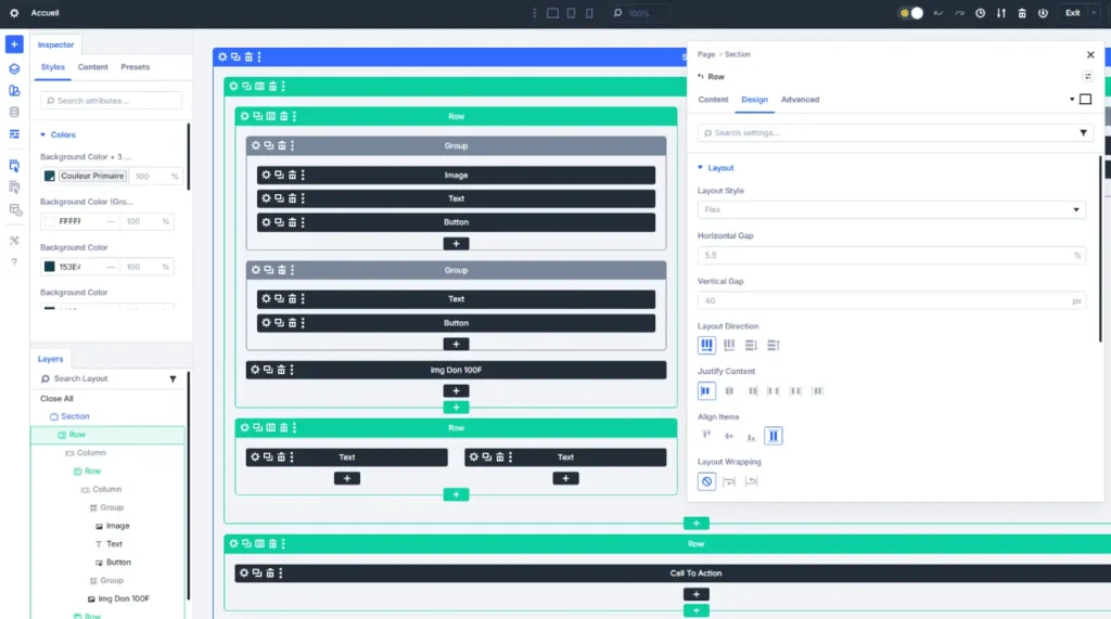
In Divi 5, go to your Row or Section settings. Under the Design > Layout tab, enable Display: Flex. You'll then have access to:
- Flex Direction (row, column, row-reverse, column-reverse)
- Justify Content (distribution along the main axis)
- Align Items (alignment along the cross axis)
- Flex Wrap (line wrapping enabled or not)
- Gap (spacing between elements)
These visual controls eliminate the need to write CSS. I timed the creation of a responsive navigation: 3 minutes with Flexbox in Divi 5 versus 15 minutes with custom CSS in Divi 4.
CSS Grid in Divi 5: the Two-Dimensional Power
CSS Grid's Strengths
Grid revolutionizes complex layouts by allowing simultaneous control over rows and columns. Its strength lies in explicitly defining a structure, then precisely placing elements within that grid.
Pros:
- Total two-dimensional control (rows AND columns simultaneously)
- Named areas (
grid-template-areas) that make the code readable like a visual mockup - Easy element overlapping with
z-indexfor magazine-style designs - Centralized
gapproperty to manage all spacing without margin calculations - Automatic column count adaptation with
auto-fitandminmax(), reducing the need for media queries
Cons / Caveats:
- Steeper learning curve than Flexbox
- Requires planning the structure before starting (architectural approach)
- Overkill for simple one-dimensional alignments
- Can become complex on very dense grids (more than 20 elements)
Practical CSS Grid Use Cases with Divi 5
Five scenarios where Grid is essential:
Scenario 1: Asymmetrical image gallery Portfolio with images of different sizes. The main image occupies 2 rows × 2 columns, secondary images 1 row × 1 column. Grid allows precise placement of each image with grid-row and grid-column.
Scenario 2: E-commerce dashboard Interface with header at the top, sidebar on the left, main content area in the center, and statistics area on the right. Grid defines the global structure with grid-template-areas, making the layout immediately understandable.
Scenario 3: Magazine homepage Complex layout with a large featured image, several secondary articles, advertising, and newsletter. Elements partially overlap to create visual depth. Grid facilitates these overlaps with z-index control.
Scenario 4: WooCommerce product grid Shop with 3 columns on desktop that automatically switch to 2 on tablet and 1 on mobile. Grid with repeat(auto-fit, minmax(300px, 1fr)) adapts the number of columns without complex media queries.
Scenario 5: Features section Grid of 6 cards (2 rows × 3 columns) with uniform spacing. The gap: 20px property centrally manages all spacing, avoiding complicated margin calculations.

CSS Grid Configuration Example in Divi 5
In your Section or Row settings, enable Display: Grid under the Design > Layout tab. Divi 5 exposes:
- Grid Template Columns (definition of column count and size)
- Grid Template Rows (definition of rows)
- Grid Auto Flow (automatic filling)
- Column Gap and Row Gap (spacing)
- Placement controls for each child module (Grid Column Start/End, Grid Row Start/End)
For a photographer's gallery project, I created a complex asymmetrical layout in 20 minutes using these visual controls. The same result would have required 2 hours of custom CSS and responsive debugging.
When to Use Flexbox and when to Use CSS Grid?
The question isn't about choosing one or the other definitively, but understanding their strengths to use them at the right time.
Use Flexbox When
- You're organizing elements along a single axis (row OR column)
- You want the content to dictate its size and distribution
- You're creating components like navigation bars, card lists, button groups
- You're aligning elements inside a block or grid cell
- You need dynamic adaptation with
flex-growandflex-shrink
Concrete examples:
- Navigation with logo, menu, and CTA
- Footer with link columns
- Inline product cards
- Action toolbar
- Testimonial list
Use CSS Grid When
- You're defining a two-dimensional structure (rows AND columns)
- You need precise control over element placement
- You're creating the global skeleton of your page (header, main, sidebar, footer)
- You want elements that overlap or occupy multiple cells
- You're managing complex grids with automatic column count adaptation
Concrete examples:
- Image gallery with variable sizes
- Dashboard with multiple areas
- Magazine layout with overlaps
- E-commerce product grid
- Homepage with nested sections
The Winning Combination: Grid + Flexbox Together
The optimal approach is to use Grid for the global structure and Flexbox within the cells. For example, create your main layout with Grid (header, main content, sidebar, footer), then use Flexbox in the "main content" area to align a series of blog cards.
I applied this strategy to a web agency site. Grid defines the four main areas of the homepage. Within each area, Flexbox manages module alignment. The code is 50% shorter than the old full-Flexbox version, and responsive adjustments are made in a few clicks.
Important point: you can use Flexbox inside a CSS grid, but not the other way around. This natural hierarchy reinforces the complementarity of the two tools.
To see the power of Grid in action on real-world layouts, discover these 5 examples of advanced layouts now possible with Divi 5.
Comparison Table: Grid vs Flexbox at a Glance
| Criterion | Flexbox | CSS Grid |
|---|---|---|
| Dimensionality | One-dimensional (1 axis) | Two-dimensional (2 axes) |
| Philosophy | Content-centric | Structure-centric |
| Optimal Use | Components and simple alignments | Complex structures and page layouts |
| Complexity | Simple to learn | Steeper learning curve |
| Overlapping | Difficult (negative margins) | Easy (grid positioning + z-index) |
| Responsive adaptation | flex-wrap + breakpoints | auto-fit / auto-fill + breakpoints |
| Spacing | Individual margins or gap | gap centralized for the entire grid |
| Display Order | Modifiable with order | Modifiable with grid-row/column |
| Combination | Can be nested in Grid | Cannot contain Grid |
| Typical Cases | Navigation, inline cards, footers | Galleries, dashboards, magazine layouts |
Testing Protocol on Real Projects
Here's how I compared Grid and Flexbox in concrete contexts.
Context:
- Hosting: VPS with Redis cache enabled
- Version: Divi 5.0, WordPress 6.4.2
- Plugins: Yoast SEO, WP Rocket, WooCommerce (15 active plugins)
- Environment: Real client sites with traffic from 5k to 50k visitors/month
Test scenario:
- Creating responsive navigation: timing the setup from scratch
- Flexbox: 3 minutes (Divi visual controls)
- Grid: 8 minutes (too complex for this simple case)
- Verdict: Flexbox wins (simplicity suited to the need)
- Asymmetrical portfolio gallery: 20 images of variable sizes
- Flexbox: 45 minutes (many CSS hacks for positioning)
- Grid: 18 minutes (precise placement with visual controls)
- Verdict: Grid wins (two-dimensional control needed)
- Complex magazine homepage: 8 different areas with overlaps
- Flexbox: 90 minutes (negative margins and
position: absoluteneeded) - Grid: 35 minutes (named area definition + precise placement)
- Verdict: Grid wins (two-dimensional structure with overlaps)
- Flexbox: 90 minutes (negative margins and
- Inline service cards: 3 cards side-by-side, responsive
- Flexbox: 5 minutes (native and obvious solution)
- Grid: 7 minutes (functional but overkill)
- Verdict: Flexbox wins (simple one-dimensional alignment)
Performance Measurements:
- Load time: identical (difference < 0.05s)
- CSS weight: Grid slightly lighter on complex structures (average -15%)
- Maintainability: Grid more readable for complex structures, Flexbox for simple components
Test Limitations:
- Does not cover projects with more than 100k visitors/month
- Timings based on my experience (may vary depending on skills)
- Optimized WordPress environment (results may differ on shared hosting)
Frequently Asked Questions about Grid vs Flexbox in Divi 5
Can I Combine Grid and Flexbox on the Same Page?
Absolutely, and it's even recommended. Use Grid for your page's global structure, then Flexbox within the grid cells to align content. This approach leverages the strengths of each tool.
Which Technology Does Divi 5 Prioritize by Default?
Divi 5 natively integrates both with equal visual controls. Neither is prioritized. The choice depends on your manual activation of Display: Flex or Display: Grid mode in your section and row settings.
Do Grid or Flexbox Affect Performance?
The impact on performance is negligible. Both are native CSS properties optimized by browsers. I measured a difference of less than 0.05 seconds in loading time between the two approaches.
Can I Migrate a Flexbox Layout to Grid?
Yes, but first evaluate if Grid adds real value. If your current Flexbox layout works well, migration isn't necessary. Grid becomes relevant if you add two-dimensional complexity or overlaps.
Do Grid and Flexbox Work on all Browsers?
Yes, all modern browsers have supported Grid and Flexbox for several years. Internet Explorer 11 also supports them, with a few minor peculiarities for Grid. If you need to support IE11, test carefully or use a Flexbox fallback.
My Verdict: Grid or Flexbox Depending on your Profile
For you if (Flexbox):
- You create simple components (navigation, cards, lists)
- You organize elements along a single axis
- You are new to modern layouts
- You want quick results with a gentle learning curve
- You primarily work on simple showcase websites
For you if (CSS Grid):
- You create complex page structures
- You need precise two-dimensional control
- You create asymmetrical or magazine-style designs
- You manage image galleries or dashboards
- You are looking for a long-term maintainable code architecture
Avoid if:
- You force Grid on simple one-dimensional cases (use Flexbox)
- You force Flexbox on complex grids (use Grid)
- You haven't identified if your problem is 1D or 2D
- You think you have to choose one OR the other (use both)
Quick Decision Checklist
Before starting your layout, answer these questions:
- [ ] Does my layout require control over 1 axis (row OR column) → Flexbox
- [ ] Does my layout require control over 2 axes (rows AND columns) → Grid
- [ ] Should my elements overlap? → Grid
- [ ] Should my elements adapt dynamically to their content? → Flexbox
- [ ] I am creating a component inside an area → Flexbox
- [ ] I am creating the overall structure of my page → Grid
- [ ] I want a grid with a variable number of columns depending on the screen → Grid (with
auto-fit) - [ ] I want cards that stack automatically → Flexbox (with
flex-wrap)
Next Steps
You now know how to choose between Grid and Flexbox based on your context. To learn more:
- Learn how to create micro-interactions to enhance your layouts (article in progress)
- Discover how the Loop Builder leverages Grid for dynamic displays
- Explore the new WooCommerce modules that use Grid for unique product pages (article in progress)
The difference between Grid and Flexbox is not just a technical matter. It's a matter of dimensionality: 1D versus 2D.
Once you've identified whether your problem is one-dimensional or two-dimensional, the choice becomes obvious. And in most real-world projects, the answer is: use both. Grid for structure, Flexbox for components. This synergy will allow you to create professional layouts in a fraction of the time it took with Divi 4.

