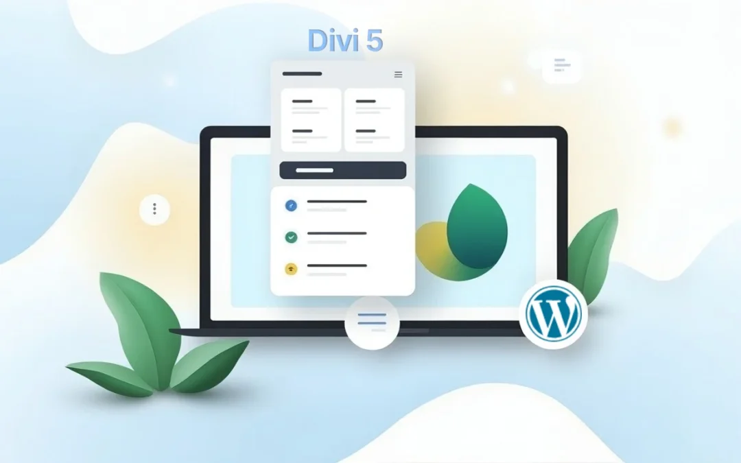
So, you thought Divi 4 was already pretty good? Well, buckle up because the new Divi 5 interface has just landed and it's mind-blowing! This new version isn't just a few cosmetic tweaks. No, no, no. It's a complete revolution with a redesigned layout system based on Flexbox and tools so smart they could almost build your sites for you (well, not quite yet, but almost!).
Elegant Themes' goal was crystal clear: to save you time, unleash your creativity, and adapt to the demands of the modern web. And frankly, mission accomplished! In this article, we're going to take a look around this brand new Divi 5 theme, focusing on the Visual Builder, that little gem that gets every web designer's heart racing.
If you're still hesitant to switch to this new version, which, as a reminder, is still in Alpha mode, I recommend you read the article "Divi 5: When to Make the Leap!". It will provide you with insights tailored to your situation and help you make an informed decision.
The Big Revolution: Flexbox Finally Lands in Divi 5
Hold on tight, because this is huge! The most significant change in Divi 5 is its brand new Flexbox-based layout system, which replaces Divi 4's old block-based layout engine. It's not just a technical update; it's a complete paradigm shift in how you build and manipulate your layouts.
Flexbox, What Exactly is it?
So, for those scratching their heads wondering "Flexbox, what is this beast?", let me enlighten you. Flexbox, or "Flexible Box Layout" for short, is a one-dimensional CSS layout module designed to organize your elements within a container. The great thing is that they behave predictably, even when the screen size changes (and believe me, with all the screens out there today, that's quite a challenge!).
It allows for efficient space distribution and powerful element alignment, even when their size plays hide-and-seek with you. It's a bit like having a personal assistant who automatically reorganizes your desk based on what you put on it.
With Divi 5, every new row now uses Flexbox by default. For those who've never touched Flexbox in CSS (and don't worry, we've all been there), it takes a little getting used to. Flexbox works differently from traditional block systems, but once you get the hang of it, it's magic!
The New Visual Controls that are Game-Changers
Divi 5's Flexbox system unlocks visual controls so powerful they'll bring tears of joy to anyone who's struggled with custom CSS. These controls completely eliminate the need to tinker with complex CSS for common layout adjustments. Gone are the days when you had to be a code wizard!
Here are the new features that will revolutionize your life as a web designer:
Wrapping: Control how your elements wrap across multiple rows or columns if space runs out. No more playing Tetris with your elements!
Direction: Define the main direction of your elements (horizontally or vertically) and their order. It's like having a magic wand to rearrange your content.
Spacing: Manage the space between and around your elements intuitively. No more calculating margins and paddings with a calculator!
Ordering: Visually reorder your elements without touching the underlying HTML structure. It's like cut-and-paste, but better.
Alignment: Precisely align your elements along the main axis and cross axis. Even perfectionists will be happy!
These built-in controls mean you can now create complex layouts that previously required "custom CSS hacks" with Divi 4, and do so much more simply and visually. For example, creating Flexbox headers that adapt beautifully to different screen sizes is now a breeze. Technology is beautiful!

Major Spring Cleaning
With the arrival of Flexbox, certain block-based features from Divi 4, such as specialized and full-width sections, are being retired. Why? Simply because Flexbox now covers all these use cases, offering a more flexible and unified solution. It's a bit like tidying up your garage: you get rid of what's no longer needed to make room for the new.
This simplification makes the builder's structure more consistent and the design more logical. And don't worry about your old projects!
All features and customizations possible in Divi 4 remain achievable in Divi 5. You still have the option to use block layouts, as was the default in Divi 4. This approach ensures a smooth transition for those not yet ready to make the leap to Flexbox.
A Redesigned Visual Builder Experience for Distraction-Free Work
Divi 5 didn't just change the layout engine. No, the team also optimized the design environment for maximum efficiency. The Visual Builder has been redesigned from the ground up to reduce distractions and speed up your workflow. And believe me, when you spend your day in a builder, every second saved counts!
An Optimized Dashboard and a Flexible Editing Environment
You know that feeling when you're in your creative flow and a small interruption ruins everything? Well, Divi 5 tackles exactly that problem! Even minor interruptions can break concentration when updating a layout. That's why the team created a more flexible editing environment.
Here are the improvements that will change your daily routine:
Dock Panels: You can now dock important settings panels to keep them visible while you work. No more endless opening and closing of panels! It's like having multiple screens, but better organized.
Multiple Modules in Tabs: It's possible to open multiple modules simultaneously, each appearing as a tab in your editing panel. This makes it easier to compare settings or switch between elements without repeatedly closing and reopening settings. Your web browser does the same with tabs, and now Divi does too!
Scroll-Free Navigation: The Layers panel offers a complete structural view of your layout, allowing you to instantly navigate to any section, row, or module with a single click. No more frantic scrolling on long or complex pages!
These changes represent a complete break from the old workflow that often looked like: open a module, save, scroll, open the next, and repeat this cycle until exhaustion. Divi 5 aims to make design more fluid and intuitive. And frankly, it's a success!

The Layers Panel: your New Navigation Compass
The Layers panel is a bit like Divi 5's GPS. It's a particularly powerful tool that offers an efficient way to navigate and manage all elements of your page during design. And believe me, once you've tried it, you won't be able to do without it!
Easy Access to all your Elements
This panel provides quick and easy access to all elements on your page, whether sections, rows, columns, or modules. It's particularly useful for complex designs with overlapping elements, transition effects, or negative margins that would otherwise be difficult to select in a traditional way. It's a bit like having an aerial view of your construction site!
Drag-and-Drop Reordering: In the Layers view, you can drag and drop your elements, rows, or sections to reorder them on your page. It's infinitely simpler than in the traditional Visual Builder. No more juggling with "Move Up" or "Move Down" buttons!
Smart Expansion and Collapse: Layers can be easily expanded and collapsed, either individually or all at once, to control the visibility of elements within each section. It's like folders on your computer, but for web design.
Filtering and Multi-Selection: The panel offers a filtering option to locate specific modules or elements. This is very practical on content-heavy pages where finding an element can feel like a treasure hunt. It also allows for multi-selection of layers, either consecutively or non-sequentially, using key combinations (Shift + Option/Ctrl or Shift + Command/Alt).
Custom Renaming: For better organization, you can rename your elements directly in the Layers view. No more meaningless "Section #42"!
Drag-and-Drop Files: Pure Simplicity
Divi 5 extends drag-and-drop functionality far beyond builder elements. Now, you can drag and drop image files, text documents, web files, and much more directly onto any Divi page. It's like turning your builder into a giant Dropbox zone!
Instant and Automatic Conversion
Once your file is dropped into the builder, the magic happens: it's instantly converted into a module. Divi automatically creates a new regular section with a single-column row at the bottom of your page, then a new module filled with your file's content based on its type. It's artificial intelligence applied to web design!
Automatic Settings: For convenience, the module settings modal window automatically appears, allowing you to immediately customize your content's design. No need to search for what to do next, Divi guides you!
Smart Code Management: When you drag and drop CSS snippets, they are automatically added to the page's CSS and organized with comments to identify code blocks. Similarly, HTML files can be dragged and dropped and cleanly integrated into your page.
Conclusion: the New Divi 5 Interface, a Worthwhile Revolution
In summary, Divi 5 isn't just an update, it's a real revolution! With its Flexbox system, redesigned Visual Builder, and smart features like drag-and-drop file uploads, this new version radically transforms the website creation experience.
The goal was ambitious: to allow users to work faster, design more freely, and adapt to the demands of the modern web. Mission more than accomplished! Whether you're a beginner discovering the world of web design or a seasoned expert, Divi 5 has something to offer you.
Download the latest version to try it out.
The transition might require a little adjustment, especially if you've never used Flexbox, but the benefits are well worth it. Once you get the hang of these new tools, you'll wonder how you ever managed without them.
Recommended tools marked with the % icon indicate that they generate an affiliate commission if you choose them, at no additional cost to you. For more details, you can view the full transparency clause page.