Starting Point
We've all experienced that moment: you're proud of your layout, everything's perfect... until you switch to the mobile version. Then, to your horror: your button has wandered off below your image, your text is crammed into a corner, and you seriously wonder if WordPress isn't out to get you.
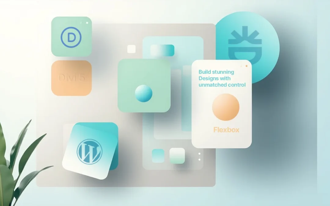
Good news: Divi 5 comes with a secret weapon to help us avoid these everyday dramas — Flexbox. No more coding like a CSS ninja; the visual builder now supports this modern system, directly integrated into the settings.
In this article, I'm going to explain to you what Flexbox is, why Divi 5 made it its new engine, and especially how to actually use it to create modern, fluid layouts that are... finally aligned just the way you want them.
Spoiler: your buttons will (finally) stay put exactly where you place them.
The prerequisites to get the most out of Divi 5
Before migrating or creating a new site with Divi 5, I recommend having the latest tools from the Elegant Themes ecosystem. You can check out Divi Pro for Divi 5 🔗 to access advanced features, Divi AI for AI-assisted content and design creation 🔗 to speed up your production, as well as Divi Hosting optimized for Divi 5 🔗 to benefit from hosting specifically configured for performance and builder compatibility.
What is Flexbox (Explained without Jargon)
Flexbox (or "Flexible Box Layout") is a CSS layout model that allows you to manage the arrangement, alignment, and distribution of elements within a box (a container).
Simply put: imagine an egg carton. Whether there are 6, 8, or 12 eggs, the compartments always adapt, and nothing rolls onto the floor. That's Flexbox: your elements (the eggs) are automatically aligned and distributed within their container (the carton), regardless of screen size.
Three Key Concepts to Remember:
- The flex container: it's the parent element, the one that sets the rules.
- The flex items: these are the children (modules, columns, etc.), which adapt to the set rules.
- The main axis and the cross axis: Flexbox organizes everything along a main axis (horizontal or vertical), and then adjusts the alignment on the cross axis.
With this, you already understand 80% of the system. The rest is just playing with the options.

Why Divi 5 Adopted Flexbox
Before Divi 5, the theme used a mix of proprietary systems: special sections, full-width rows, floats, and other hacks. It worked... but it was heavy, not very flexible, and sometimes frankly painful to maintain.
With Divi 5, Elegant Themes started from scratch:
- A single layout engine: Flexbox.
- Better performance (less unnecessary code to load).
- Simplified responsive compatibility: everything adapts more naturally, without a thousand settings per breakpoint.
In short, Flexbox isn't just a gadget: it's the foundation for all new layouts in Divi 5.
How to Activate Flexbox in Divi 5
The good news is that you don't need to dive into CSS: everything is directly in the Visual Builder.
- Open a section or a row.
- Click on the Design > Layout tab.
- Choose "Flex" (instead of "Block").
Boom. You've just transformed your container into a Flexbox. Your child elements become "flex items," and you can now align them however you want, just with visual options.
Flexbox Settings in Divi 5 (Human-Friendly Translation)
Here's a small dictionary of the settings you'll encounter:
- Layout direction: aligns child elements in a row, in a column, or the inverse.
- Justify content: manages horizontal distribution (left, center, right, equal space...).
- Align items: controls vertical alignment (top, center, bottom, stretched).
- Wrap: allows elements to wrap to the next line if space is insufficient.
- Horizontal and vertical gap: sets the spacing between columns/rows, without having to mess with margins.
👉 Tip: Have fun clicking on the icons in Divi. They are very visual and instantly show you what changes.

Practical Examples of Flexbox Layouts
Flexbox becomes truly interesting when you apply it to practical cases. Here are five that resonate with everyone:
1. A Balanced Header
Logo on the left, menu centered, "Contact" button on the right: before, you would have struggled with margins and CSS. With Flexbox, one line is enough.
2. A Product Card Grid
Each card automatically adjusts its height, even if one description is longer than another. Alignment guaranteed.
3. A Testimonials Section
Columns with vertically centered text, no fuss. Your clients are happy, and so are you.
4. A Multi-Column Footer
No matter the content of each column, everything remains neatly aligned.
5. A CTA (Call-to-Action) Section
Vertically centered text, perfectly aligned button: it's effortlessly eye-catching.
Flexbox + other Divi 5 Tools: the Winning Combo
Flexbox isn't the only player. It works hand in hand with other new features in Divi 5:
- Nested rows: create complex grids without breaking the layout.
- Module groups: organize multiple modules as a single unit.
- Presets & variables: maintain a consistent design without redoing everything every time.
- Loop Builder: display dynamic content in flexible grids.
👉 Result: You can create sophisticated layouts without writing a single line of CSS.
Common Mistakes (and how to Avoid Them)
Even with Flexbox, some pitfalls await:
- Forgetting to wrap: your modules overflow on mobile → activate "Wrap".
- Overusing manual margins: prefer "gap" properties, which are cleaner and more consistent.
- Thinking Flexbox replaces everything: for complex grids (magazines, calendars), CSS Grid remains more suitable.
- Not testing on mobile: some perfect desktop alignments fall apart on small screens.
FAQ: Questions We all Ask
1. What's the difference between Flexbox and CSS Grid?
Flexbox is designed for alignment in a single dimension (row OR column). CSS Grid, on the other hand, handles both dimensions (rows AND columns). For simple, adaptive layouts → Flexbox. For magazine-style grids → Grid.
2. Should I still use Divi 4's special sections?
No, they are replaced by nested rows and Flexbox. Less complexity, more flexibility.
3. How do I manage different alignments between desktop and mobile?
Divi 5 allows you to define Flexbox settings per device. You can reverse columns on mobile, center your content, etc.
4. Does Flexbox slow down my site?
On the contrary. Divi 5 has been optimized around Flexbox, which lightens the generated code and improves performance.
5. Can I use custom CSS with Flexbox in Divi 5?
Yes, of course. You can add your own rules (e.g., align-self, flex-grow) via the "Advanced > CSS" tab.
6. Does Flexbox also work with WooCommerce?
Absolutely. Divi 5's WooCommerce modules also inherit the Flexbox system. You can align your products or CTAs however you like.
Useful Resources to Go Further
Conclusion: Dive in, Flex a Bit!
Flexbox in Divi 5 is like going from a temperamental old car to a modern car with power steering. You still drive the same road (creating your pages), but without breaking a sweat on every turn (the alignments).
Test it out now, even on a small section. You'll quickly see the difference. And if you mess up? No big deal: at worst, you'll have a juicy anecdote to share at the next WordCamp.
Tools marked with 🔗 are affiliate links. If you make a purchase, I earn a commission at no extra cost to you. For more details, you can view the full transparency disclosure page.