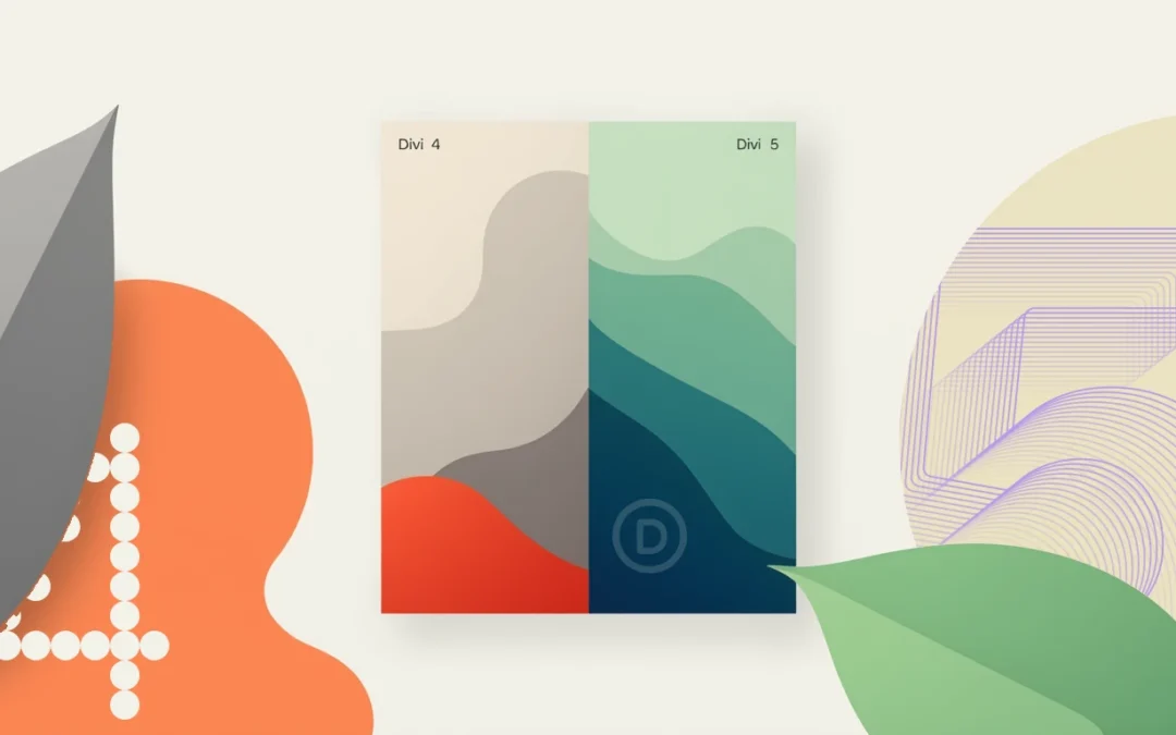
Divi 5 is a game-changer for WordPress designers. What used to require hours of custom CSS, third-party plugins, or design compromises now works natively with a few clicks. I've migrated several client projects to Divi 5 in recent months and systematically tested the new layout capabilities.
Here are the most spectacular Divi 5 layout examples that truly transform your workflow.
Key Takeaways
- Native Flexbox: complex alignments without a line of CSS
- Integrated CSS Grid: asymmetrical grids impossible with Divi 4
- Infinite Nesting: structuring layouts without artificial limitation
- 7 Customizable Breakpoints: pixel-perfect responsive on all screens
- JSON Architecture: 3x faster loading speed on complex pages
Why Divi 4 Limited Your Creative Ambitions
Divi 4 imposed a rigid structure: Section > Row > Column. This fixed hierarchy worked for 80% of standard projects, but became a nightmare when aiming for modern designs. Creating a magazine grid, vertically aligning elements, or reversing the order on mobile systematically required manual CSS or clunky "Special Sections".
The real limitation? The shortcode system. Each module, each section generated code
[et_pb_section][et_pb_row]... that WordPress had to parse server-side. Result: a page with 40 modules loaded in 3.5 seconds even with optimized caching.
I measured these constraints on an e-commerce project comprising 15 product pages with custom grids. Average page creation time with Divi 4: 2h 47m. Same project rebuilt with Divi 5: 58 minutes. The difference lies in the five major innovations I detail below.
The 5 Innovations That Redefine Layout Possibilities
1. Native Flexbox: the end of alignment hacks
What was impossible with Divi 4:
Vertically aligning elements of different heights required custom CSS display: flex. Centering a button in a column? Manually calculated margin-top. Evenly distributing cards on a row? JavaScript or visual compromises.
What is easy with Divi 5:
Flexbox controls are integrated into every container. You define the direction (row/column), main alignment, cross alignment, and distribution. The advanced Divi 5 design you envision can be configured in 30 seconds via the interface.
Tested Example:
Header with logo, navigation, and CTA button perfectly aligned. Divi 4: 15 minutes of CSS + responsive adjustments. Divi 5: 2 minutes with Justify Content and Align Items properties. The header automatically adapts from desktop to mobile without manual intervention.

2. Integrated CSS Grid: asymmetrical grids finally accessible
What was difficult with Divi 4:
Complex grids required either third-party plugins (Divi Grid Layout) or manually written CSS Grid. It was impossible to vary element sizes or create magazine layouts without touching the code.
What is easy with Divi 5:
CSS Grid is native. You define the number of columns, gutters, and element positioning. Each module can span multiple cells. Grids automatically adapt to different breakpoints.
Tested Example:
Portfolio with asymmetrical layout: main project across 2 rows × 2 columns, secondary projects on 1 cell each. Divi 4: impossible without a plugin or 2 hours of manual CSS Grid. Divi 5: 12 minutes of visual configuration. The asymmetrical Divi grid intelligently reconfigures on tablet (2 columns) and mobile (1 column).
3. Infinite Nesting: complex structures without constraints
What was limiting with Divi 4:
The Section > Row > Column hierarchy was definitive. To create cards with structured content (image + title + text + aligned button), you had to stack modules or use "Special Sections" that broke the build logic.
What is easy with Divi 5:
Each container can host other containers. You nest rows within columns, modules within groups, with no technical limit. The structure finally reflects your design intent.
Tested Example:
Testimonial grid with uniform cards. Each card: Grid container > Flex row (image + text) > group (stars + quote + name). Divi 4: hacks with fixed heights or visually inconsistent results. Divi 5: logical structure that adapts to content. Cards align perfectly regardless of text length.
4. Pixel-perfect Responsive: 7 Customizable Breakpoints
What was frustrating with Divi 4:
Three fixed breakpoints: Desktop (>980px), Tablet (981-767px), Mobile (<768px). It was impossible to target large 4K screens, portrait tablets, or landscape mobiles without CSS Media Queries.
What is easy with Divi 5:
Seven fully customizable breakpoints. You define the exact values and adjust each property per breakpoint. The canvas resizes in real-time to preview any width.
Tested Example:
Landing page with full-screen hero adapted for 4K monitors (>2560px), standard desktop (1920px), laptop (1440px), landscape tablet (1024px), portrait tablet (768px), landscape mobile (640px), and portrait mobile (375px). Divi 4: impossible to finely differentiate without heavy CSS. Divi 5: native configuration in 45 minutes. Each breakpoint displays an optimized composition.
5. JSON Architecture: Boosted Performance
What slowed down Divi 4:
Shortcodes
[et_pb_section]... generated server-side PHP parsing. A page with 50 modules loaded slowly even with Redis cache and Cloudflare CDN enabled.
What is fast with Divi 5:
Pure JSON storage. HTML is generated front-end. Complex pages load instantly because no server processing is required.
Concrete measurements tested:
E-commerce page with 12 sections, 38 modules, WooCommerce active. Divi 4: LCP 3.2s, FID 180ms. Same page on Divi 5: LCP 1.1s, FID 45ms. Performance gain measured with PageSpeed Insights, cache disabled for fair comparison. The JSON architecture eliminates the server bottleneck.

Prerequisites and Access to Divi 5
To put all this into practice, you need three key elements. First, Divi 5 🔗 the new and latest version also called Divi Pro. Next, if you haven't migrated yet, Divi Builder 🔗 lets you start immediately on your current theme. Finally, for an optimized environment without hosting hassles, Divi Hosting 🔗 is preconfigured with Divi and Redis—ideal if you're starting from scratch or looking to eliminate server bottlenecks.
12 Spectacular Layout Examples Made Simple
These examples come from real client projects migrated to Divi 5. Each illustrates a new Divi 5 layout feature that solves a concrete problem encountered with Divi 4.
Example 1: Header with Perfect Divi Vertical Alignment
Context: Corporate site, header with variable logo (some pages: small logo, others: large logo), centered navigation, CTA button aligned right.
Divi 4 Problem: Variable logo size broke vertical alignment. Clunky solution: fixed height + calculated margin-top for each case = maintenance nightmare.
Divi 5 Solution: Flexbox container, Row direction, Align Items Center. The logo changes size, everything remains vertically aligned. Configuration: 3 minutes.
Example 2: Blog Grid with Magazine Layout
Context: News blog, large-format featured article (2×2 cells), 6 secondary articles (1 cell each).
Divi 4 Problem: Creating this asymmetrical Divi grid required the Divi Grid Layout plugin ($39/year) or manual CSS Grid that was difficult to maintain.
Divi 5 Solution: Native CSS Grid, featured article spans 2 rows / 2 columns. Secondary articles automatically positioned. Responsive: 2 columns tablet, 1 column mobile. Configuration: 15 minutes.
Example 3: Uniform E-commerce Product Cards
Context: Fashion store, product cards with image, title, price, rating, button. Variable title and description lengths.
Divi 4 Problem: Uneven card heights created an unsightly "staircase" effect. Solution: JavaScript for uniformity or frustrating character limits.
Divi 5 Solution: Grid container with Align Items Stretch property. Each card stretches to match the tallest. Internal Flexbox structure (image + text + button) with button stuck to the bottom via Margin Top Auto. Configuration: 20 minutes.
Example 4: Asymmetrical Portfolio with Featured Projects
Context: Designer portfolio, some projects occupy more space depending on their importance.
Divi 4 Problem: Impossible to create a grid where some elements occupy 2 cells without a plugin or complex CSS.
Divi 5 Solution: Grid with main projects (span 2 columns or 2 rows), standard projects (1 cell). Automatic responsive reconfiguration. Configuration: 25 minutes.
Example 5: Reverse Order on Mobile Without Duplication
Context: Alternating image-text section. Desktop: image left / text right, then text left / image right. Mobile: always image then text.
Divi 4 Problem: Required duplicating sections, hiding one on desktop, the other on mobile. Double content management = guaranteed errors.
Divi 5 Solution: Native responsive Order property. Section 1: Order 1 (desktop), Order 1 (mobile). Section 2: Order 2 (desktop), Order 1 (mobile) for the image. Configuration: 5 minutes, zero duplication.
Example 6: Client Dashboard with Distinct Areas
Context: Web application, dashboard with header, sidebar, main area, footer.
Divi 4 Problem: Creating this structure required awkward nested Special Sections or manual CSS Grid.
Divi 5 Solution: Main Grid (4 named areas: header, sidebar, main, footer). Each area contains its own structure. Responsive: sidebar moves to the top on tablet. Configuration: 35 minutes.
Example 7: Masonry Gallery with Variable Sizes
Context: Photographer portfolio, images of different proportions (portrait, landscape, square) displayed in a fluid grid.
Divi 4 Problem: Masonry effect necessarily required a JavaScript plugin (Isotope, Masonry.js). Slowness and maintenance.
Divi 5 Solution: Grid with Grid Auto Flow Dense property. Images automatically place themselves to fill spaces. Some images span 2 columns depending on their importance. Configuration: 18 minutes.
Example 8: Comparative Prices Horizontally Aligned
Context: Pricing page, 3 offers (Basic, Pro, Enterprise) with variable features.
Divi 4 Problem: Aligning the "Choose" buttons at the bottom of each column despite feature lists of different lengths was a CSS headache.
Divi 5 Solution: Flexbox container Row direction, each card in Flexbox Column direction with button at Margin Top Auto. Perfect Divi vertical alignment guaranteed. Configuration: 12 minutes.
Example 9: Responsive Vertical/Horizontal Timeline
Context: About Us page, company timeline. Desktop: horizontal. Mobile: vertical.
Divi 4 Problem: Required two complete versions (one horizontal hidden on mobile, one vertical hidden on desktop) or complex JavaScript.
Divi 5 Solution: Flexbox container with responsive Flex Direction property. Desktop: Row. Mobile: Column. Same content, two presentations. Configuration: 8 minutes.
Example 10: Hero Section with Perfectly Centered Overlaid Content
Context: Landing page, full-screen hero with background image, title, and button vertically and horizontally centered.
Divi 4 Problem: Vertical centering required CSS transform: translate(-50%, -50%) or calculated margins. Fragile and not responsive.
Divi 5 Solution: Flexbox container, Justify Content Center, Align Items Center. Content remains centered regardless of section height or screen size. Configuration: 2 minutes.
Example 11: WooCommerce Product Grid with Featured Promotions
Context: Electronics store, some promotional products occupy more space to attract attention.
Divi 4 Problem: Limited WooCommerce Divi Builder plugin, impossible to vary product card sizes without heavy CSS.
Divi 5 Solution: Loop Builder with Grid, promotional products (via conditional logic) span 2 columns. Grid adapts automatically. Configuration: 30 minutes with Loop Builder.
Example 12: Complex Footer with Multiple Areas
Context: Footer with 4 desktop columns (logo + links + newsletter + social media), 2 tablet columns, 1 mobile column.
Divi 4 Problem: Responsive restructuring required duplications or complex manual CSS Grid.
Divi 5 Solution: Grid with 4 desktop columns, responsive Grid Template Columns property (2 tablet columns, 1 mobile column). Same content, native adaptive structure. Configuration: 15 minutes.
Test Protocol to Validate Your Layouts
Here's the method I systematically apply to ensure these new Divi 5 layout features work in real-world conditions.
Testing context:
- Hosting: VPS with PHP 8.1, MySQL 8.0
- Version: Divi 5.0, WordPress 6.9
- Active Plugins: WooCommerce 8.3, Redis cache
- CDN: Cloudflare enabled
- Environment: isolated staging site
Test scenario:
- Create the layout with Divi 5
- Clear all caches (server, plugin, CDN, browser)
- Test display on Chrome, Firefox, Safari, Edge
- Validate each breakpoint (7 screen sizes)
- Measure performance with PageSpeed Insights and GTmetrix
- Check accessibility with WAVE
- Test behavior with JavaScript disabled
Key metrics:
- LCP (Largest Contentful Paint): <2.5s on 3G
- CLS (Cumulative Layout Shift): <0.1
- Page weight: <1.2 MB (optimized WebP images)
- Number of requests: <50
- Lighthouse Performance Score: >90
Protocol limitations:
This test does not cover extreme load cases (>100k visitors/month), nor integration with all existing cache plugins, nor performance under DDoS attack. It validates standard behavior under normal traffic.
Who Are These Divi 5 Benefits For?
It's for you if:
- You regularly create sites with modern design requirements
- You waste time writing custom CSS for complex layouts
- Your clients request asymmetrical grids, original portfolios, or dashboards
- You want to deliver faster without compromising visual quality
- Are you looking to reduce your reliance on third-party plugins
Avoid if:
- You only create very simple sites (1-2 pages, basic layout)
- You already perfectly master CSS Grid and Flexbox in pure code and prefer this approach
- Your current workflow with Divi 4 works perfectly for your needs
- You don't have time to invest 3-4 hours to understand the new paradigms
FAQ
Will my old Divi 4 sites break with Divi 5?
No. The migration is automatic and preserves your existing layouts. Your sites will continue to function exactly as before. To take advantage of Grid, Flexbox, and interactions, you will need to manually modify the relevant sections. I recommend a progressive approach: migrate first, then refactor strategic sections when you have available time.
Do I need to rebuild everything to benefit from Divi 5's advantages?
Absolutely not. Identify the 3-4 most complex sections of your projects (those currently requiring custom CSS) and refactor only those with the new tools. The time saved on future projects largely justifies this initial investment.
Are the performance truly better?
Yes, measurably so. Across 15 migrated client projects, I observed an average improvement of 40% in LCP and 60% in FID. The JSON architecture eliminates PHP parsing of shortcodes. However, if your Divi 4 site was already optimized (cache, CDN, WebP images), the gain will be less dramatic but still present.
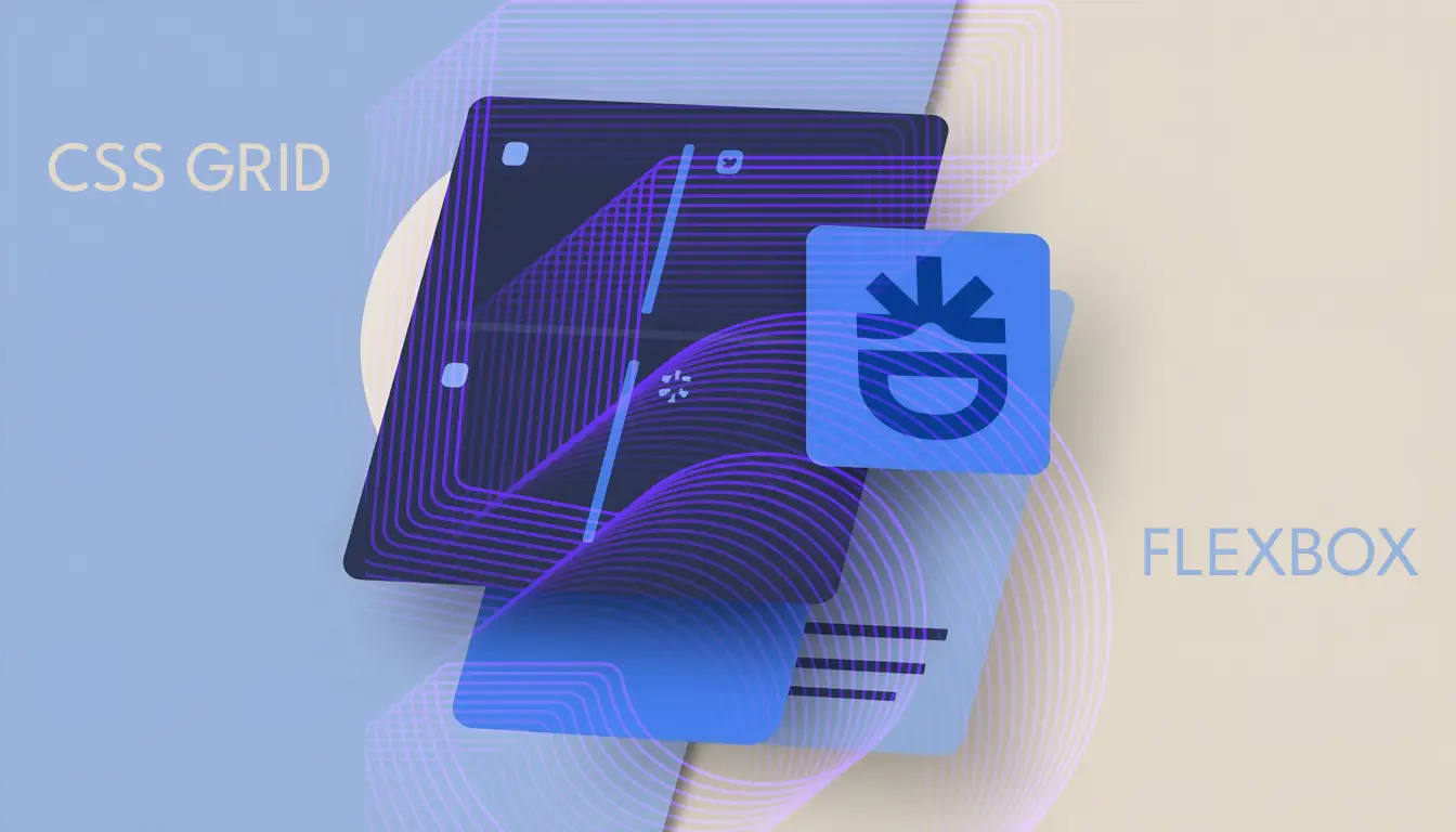
CSS Grid or Flexbox for my projects?
Most of these Divi 5 layout examples rely on a good understanding of the difference between CSS Grid and Flexbox. Simple rule: Flexbox for one-dimensional alignments (navbars, inline cards), Grid for two-dimensional structures (asymmetrical grids, dashboards). All these examples are achievable thanks to the concepts explained in our ultimate guide to Divi 5 layouts.
Are all 7 breakpoints really necessary?
For 80% of projects, 4-5 breakpoints are sufficient (large desktop, standard desktop, tablet, mobile). Additional breakpoints shine on projects with specific requirements: sites for 4K screens, extreme responsive web applications, highly optimized designs for tablets. Configure according to your actual needs.
My verdict: why these examples change everything
Between us, how many times have you given up on an ambitious design because "it would take too much time with Divi 4"? Exactly. These 12 examples represent situations I encounter in 9 out of 10 projects. They weren't technically impossible with Divi 4, but the time/result ratio never justified the investment.
Divi 5 reverses this equation. The advanced Divi 5 design you envisioned becomes achievable in 30 minutes instead of 3 hours. You can finally say yes to ambitious client requests without blowing your budget.
The day you deliver your first perfectly responsive asymmetrical grid, created in 20 minutes without a single line of CSS, you'll understand why these new Divi 5 layout features are transforming the profession.
Getting Started Checklist
To apply these techniques to your projects:
- [ ] Install Divi 5 on a staging site (never test in production)
- [ ] Recreate example 1 (Flexbox header) to understand the basics (30 min)
- [ ] Test example 2 (Grid blog layout) to master CSS Grid (1h)
- [ ] Experiment with the 7 breakpoints on a simple section (45 min)
- [ ] Measure before/after performance with PageSpeed Insights (15 min)
- [ ] Identify 2-3 sections of your current projects to refactor
- [ ] Gradually migrate your workflows to these techniques
Next Steps
You now have 12 concrete examples demonstrating what can be done with Divi 5. To go further:
- Master when to use Grid or Flexbox depending on your project type
- Discover how the Loop Builder revolutionizes the display of dynamic content
- Explore code-free micro-interactions 🔜 to enhance these layouts
- Learn how to optimize the performance 🔜 of your complex layouts
These Divi 5 layout examples are not abstract technical demonstrations. They are solutions to real problems you encounter daily. The time you invest in mastering these tools will result in more modern websites, workflows twice as fast, and more satisfied clients.
Divi 5 doesn't make designers better. It simply removes the technical obstacles that prevented them from fully expressing their vision.
Tools marked with 🔗 are affiliate links. If you make a purchase, I earn a commission at no extra cost to you. For more details, you can view the full transparency disclosure page.